remedy
a healthcare one-stop shopping assistant
CONCEPTUAL PROJECT
OVERVIEW
BRIEF
I participated in a design challenge hosted by IterateUX with a team of fellow designers and tackled the issue of creating an e-commerce one-stop shopping app. This challenge pushed our team to harness creativity and problem-solving skills to develop a simple and easy shopping experience. We ended up finishing as a top scoring team!
ROLE
Product Designer
user research, interaction, visual, prototyping & testing
TEAM
Hugo Hernandez
Vaibhavi Patankar
Happy Xu
Haley Trieu
August - September 2023
DURATION
Problem
American immigrants who lack the resources to improve medical literacy face challenges when looking for healthcare products on e-commerce platforms.
Solution
Create an MVP that focuses on making complex medical information accessible and understandable utilizing AI to assist in providing simplified explanations and guidance.
USER GOALS
An easy and simple to use app that allows users to quickly and easily compare different medical products
Build trust and confidence in users to make more informed purchasing decisions
Access to reliable health information and help with comprehending product descriptions, labels, and usage instructions in plain language, aiding their decision-making process and ensuring safe and effective use of healthcare products
BUSINESS GOALS
Drive sales growth by offering a diverse range of healthcare products and accessories backed with reliable and easy to understand information
Attract new customers within the American immigrant community by offering a user-friendly platform that addresses their unique language, cultural, and healthcare needs
Improve customer satisfaction and retention rate by building trust and confidence with complete transparency
the product
Background
The challenge began with an option of 5 prompts to choose from and we chose to narrow down to the e-commerce industry because we felt that had the most potential for positive impact on a greater range of people. We were grouped together by time zones and preferences in industry topics.
While we wanted to create a product that is helpful to all, I especially felt strongly about narrowing down our target audience even further to American immigrants. I grew up watching my parents and grandparents struggle with navigating around healthcare products and not really knowing what to get or what something means. My teammates resonated with this idea because we all come from immigrant families and each had a strong personal connection to this particular demographic.
Research & Discovery
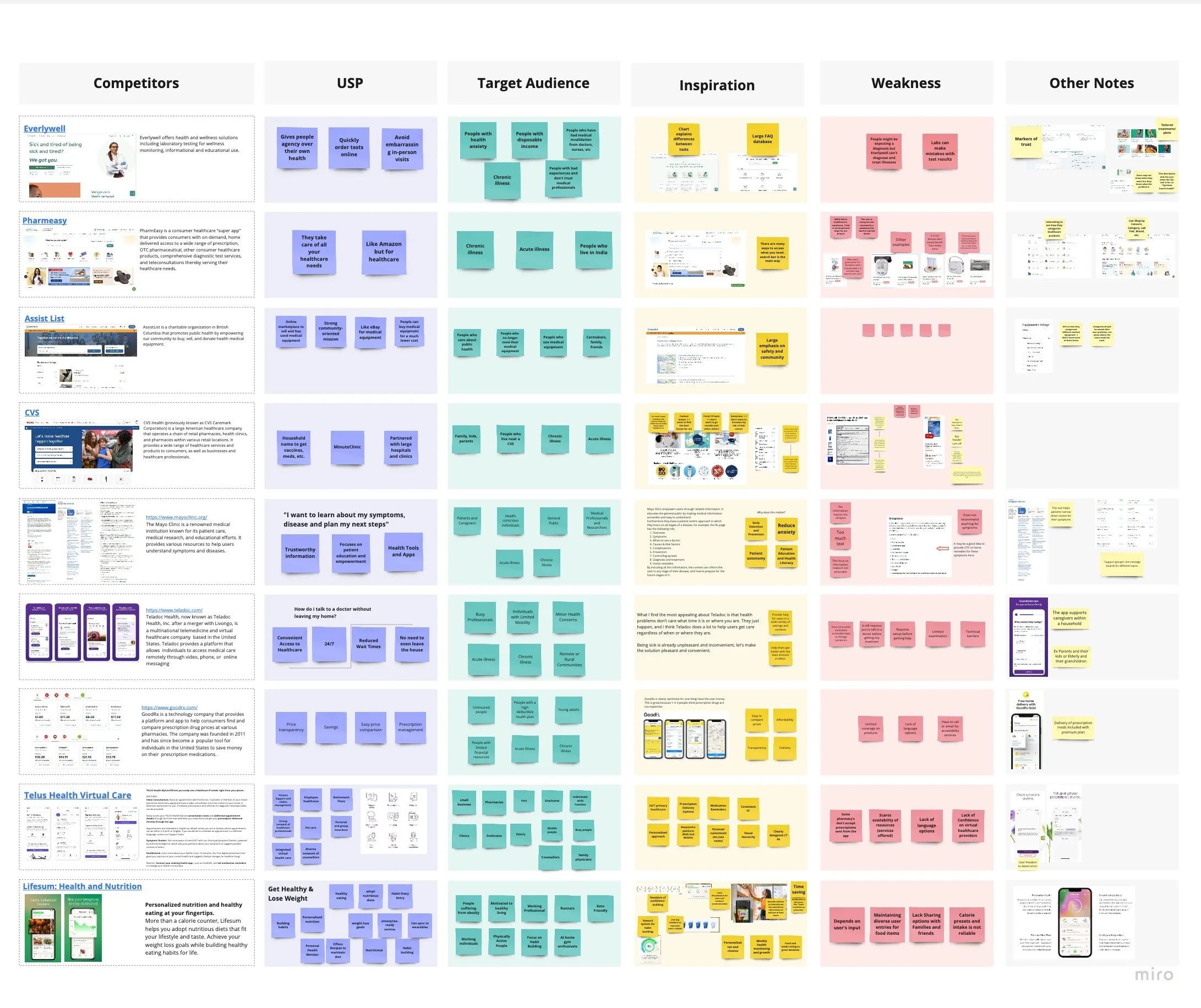
We started off the research phase with a large-scale competitive analysis and compared 9 healthcare platforms to understand their unique selling points, target audiences, weaknesses and gain inspiration.
competitive analysis
We looked at these competitors to further understand any potential pain points people face when buying over-the-counter healthcare products. My teammate, Hugo, took the lead when we were gathering insights from our analysis.
Some of the insights were:
American immigrants may rely on over-the-counter medications for treatment
They have difficulty accessing healthcare because of, but not limited to: cost of products and services, unpredictable work schedule, and language barriers
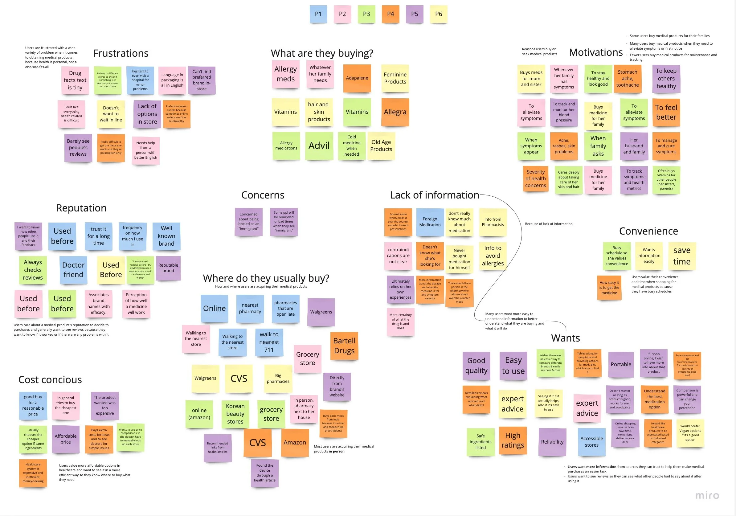
We wanted to identify the barriers that prevent users from accessing healthcare products, determine the criteria users are looking for when choosing medical products and understand the end-to-end process of how American immigrants shop for their healthcare needs. To answer these questions we each conducted 6 user interviews via video call and then used affinity mapping to synthesize our results.
affinity map
We ended up each creating an affinity map because we were curious to see if we’d develop any different insights and themes that the others would miss. I created this affinity map from the data we received from the interviews to find trends and patterns. After getting together to evaluate our results we came up with these insights:
Users value their convenience and time when shopping for medical products because they have busy schedules
Because of lack of information, many users want more easy to understand information to better understand what they are buying and what it will do
Users want more information from sources they can trust to help them make medical purchases an easier task
Shopping for healthcare products is frustrating because of complex information
Understanding the Problem
We generated several HMW questions to help guide us in what problem we wanted to solve.
How might we encourage American Immigrants who lack medical literacy to be more confident and alleviate the uncertainty when shopping and comparing healthcare products?
How might we build trust to in Americans immigrants to shop for their healthcare needs more confidently?
How might we provide guidance for people who lack medical literacy to choose more efficiently and independently?
How might we help take preventive measures for people who want to keep their loved ones healthy?
Using these as guide points, we created a main problem statement and defined our success metrics.
By making complex medical information accessible and understandable, we will alleviate uncertainty and build confidence for American immigrants who lack medical literacy.
We will know this is true when we see an increase in:
engagement (clicking certain sections, time taken for task)
conversion (making a purchase)
satisfaction (net promoter score)
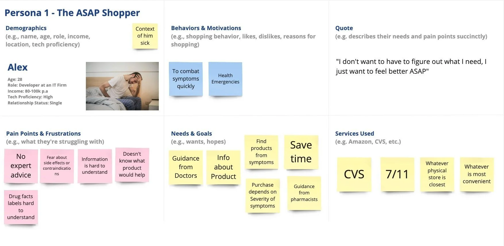
With our main problem statement in mind, we curated three user personas influenced from the same users from the interviews. Each persona covered a main pain point that was revealed from our research and interview insights.
Persona 1 is the ASAP shopper
“I don't want to have to figure out what I need, I just want to feel better ASAP"
Persona 2 is the family shopper
“I don't even know if something is helping or harming my family, and that's what worries me."
Persona 3 is the preventative shopper
"I strongly value my health, so I do all I can do to protect it"
persona 1
Ideation
As we began to brainstorm solutions, we had a plethora of ideas from choose from and a difficult time deciding which features we wanted to develop further because we only had the time and resources to flesh a few out.
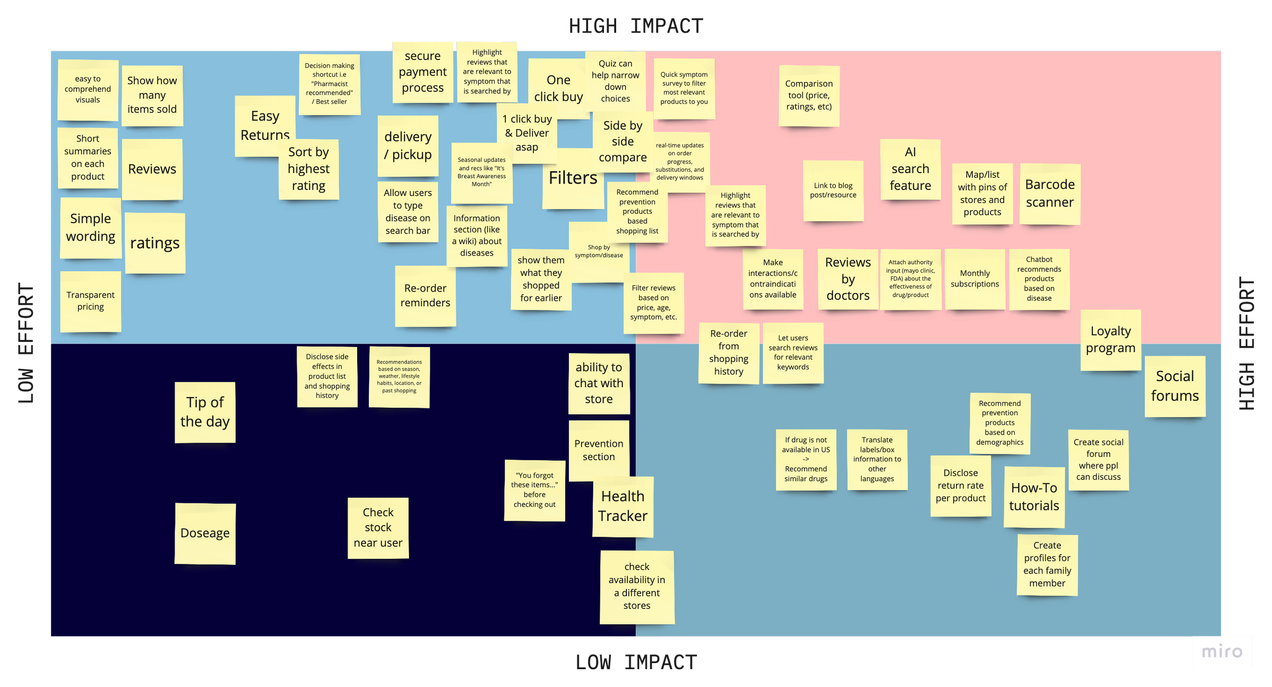
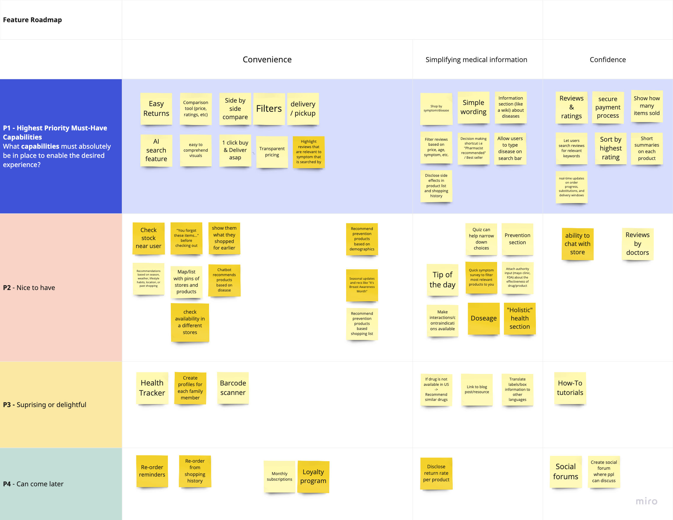
I suggested a feature roadmap to start prioritizing and while we all agreed, my teammate- Happy, still felt there was a step missing in between. After further discussion with the rest of our group, we decided to make a decision matrix and rate every idea we had through that. This helped us visually see the features that were a necessity and other features that were nice, but the effort to build it out was too high or had too low of an impact. It was amazing to see the amount of ideas the four of us were able to generate in such a short period of time.
decision matrix
feature roadmap
*note: the darker yellow notes are features we wanted to still discuss even after prioritizing
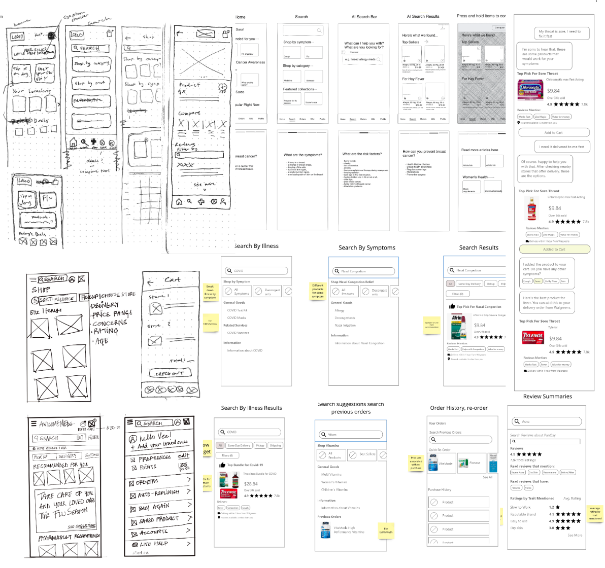
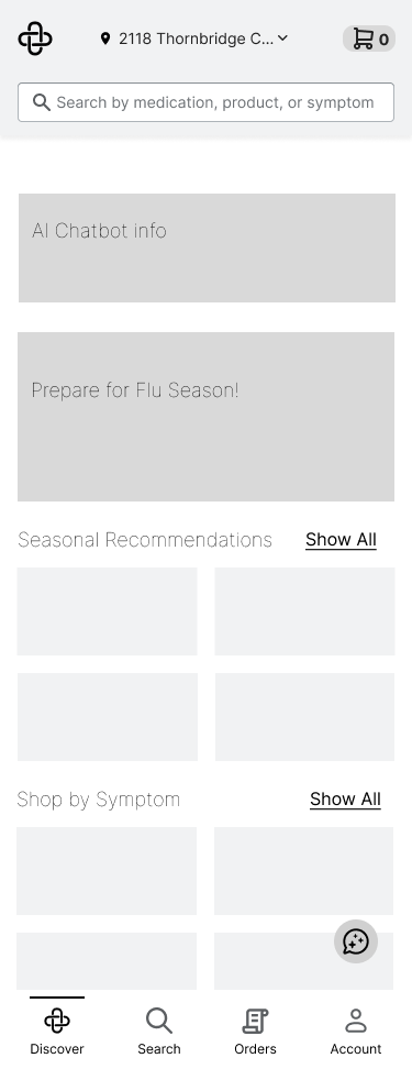
From here, we dove into sketching and creating mid-fidelity wireframes after deciding which parts and layouts we liked best from each team member. As you can see below, there were a mixture of hand-drawn and digital sketches. Quickly sketching out our ideas helped us figure out what layouts and feature ideas worked best.
sketches
Although the design challenge did not call for a testing phase, we all still wanted to do a quick usability test anyways to understand how users would go about using the application and whether our design decisions made sense.
Testing
We conducted a usability test with 5 participants with our mid-fidelity frames through video call and asked participants to complete two main tasks: searching and comparing products & getting information and help.
While we wanted to do each test with one of us as the facillitator and one as the shadower to take notes, we had to conduct them individually due to scheduling conflicts. I conducted two of the tests and my initial observations were that our chatbot was not visible enough as both of my participants did not utilize the chat feature to complete task two. After we all finished the testing, we noticed these were the main problems users were facing:
Users had difficulty finding the chat bot
Users want to compare similar items, ie. price, reviews, ratings
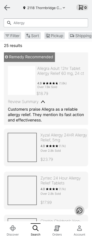
Some users did not trust the “Remedy Recommended” label, it felt sponsored
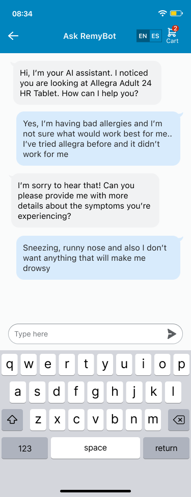
The chatbot didn’t have specific enough information on the items users were looking at, should be able to know exactly what you’re looking at and provide any details the user needs
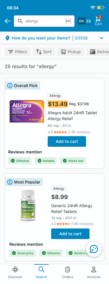
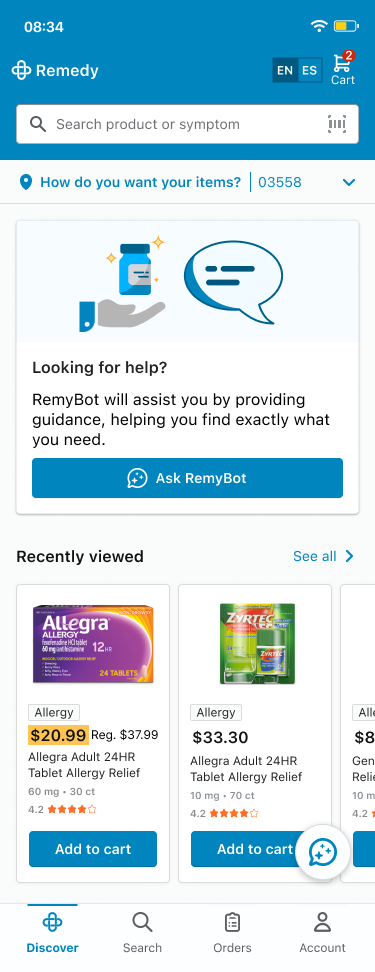
Increased discoverability for the chatbot
Added language options
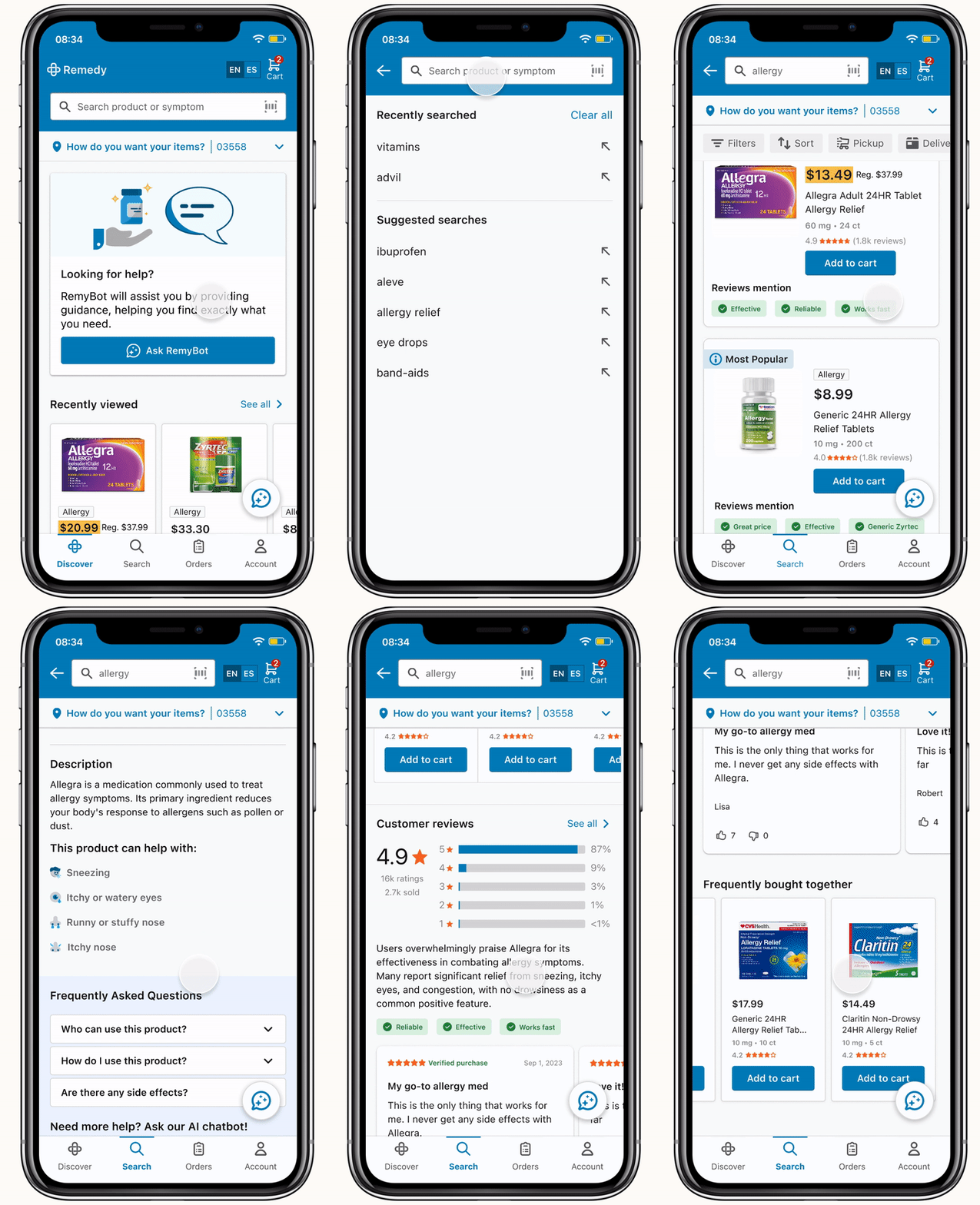
Search Results Page
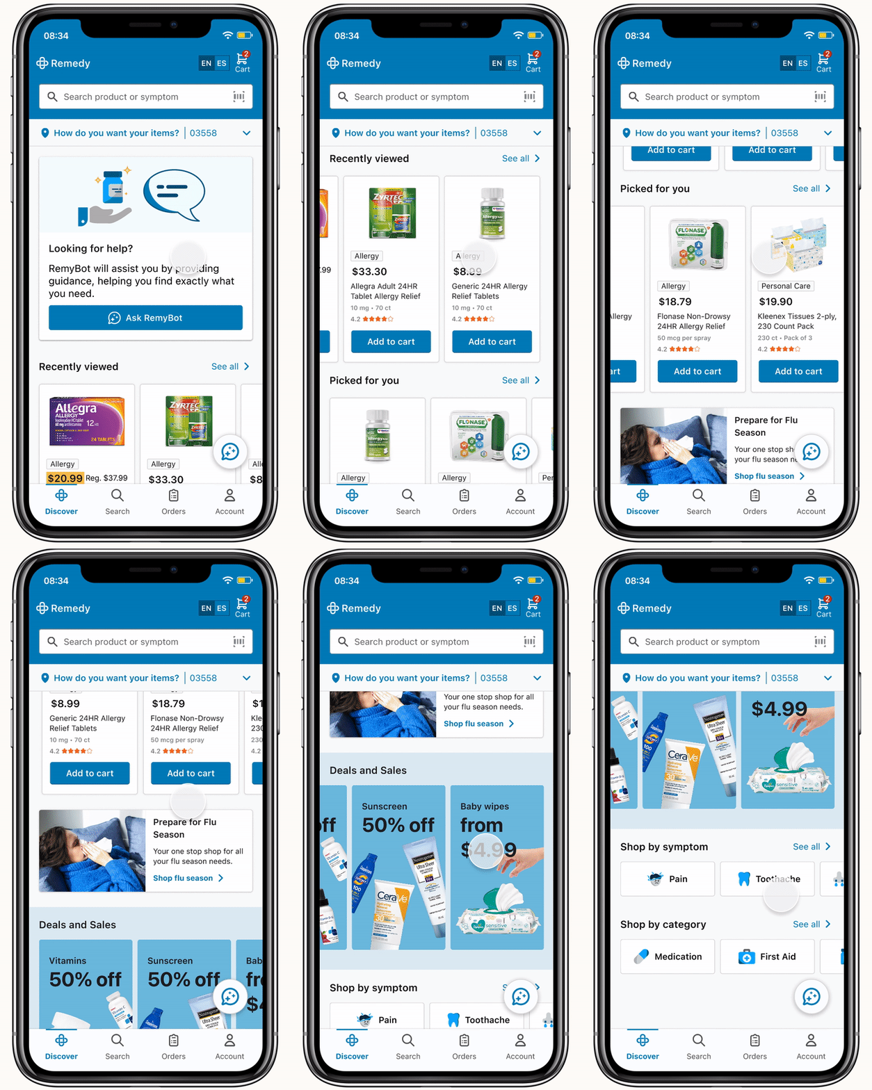
Discover Page
Easily accessible & scannable information to incorporate quick add to cart
Recommended product cards to increase user confidence
Review tags to allow users to scan easily
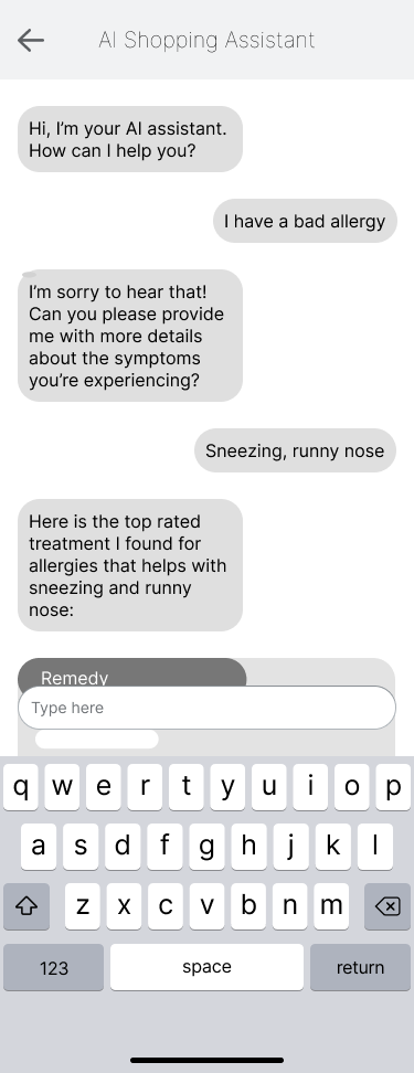
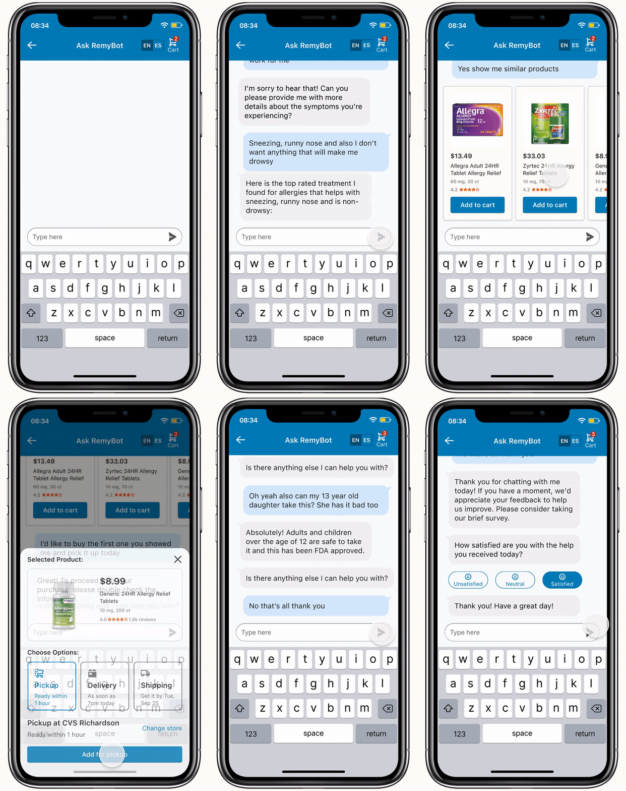
AI Chatbot Page
Our AI Chat-bot will assist our users when they need tailored guidance, helping them find exactly what they need
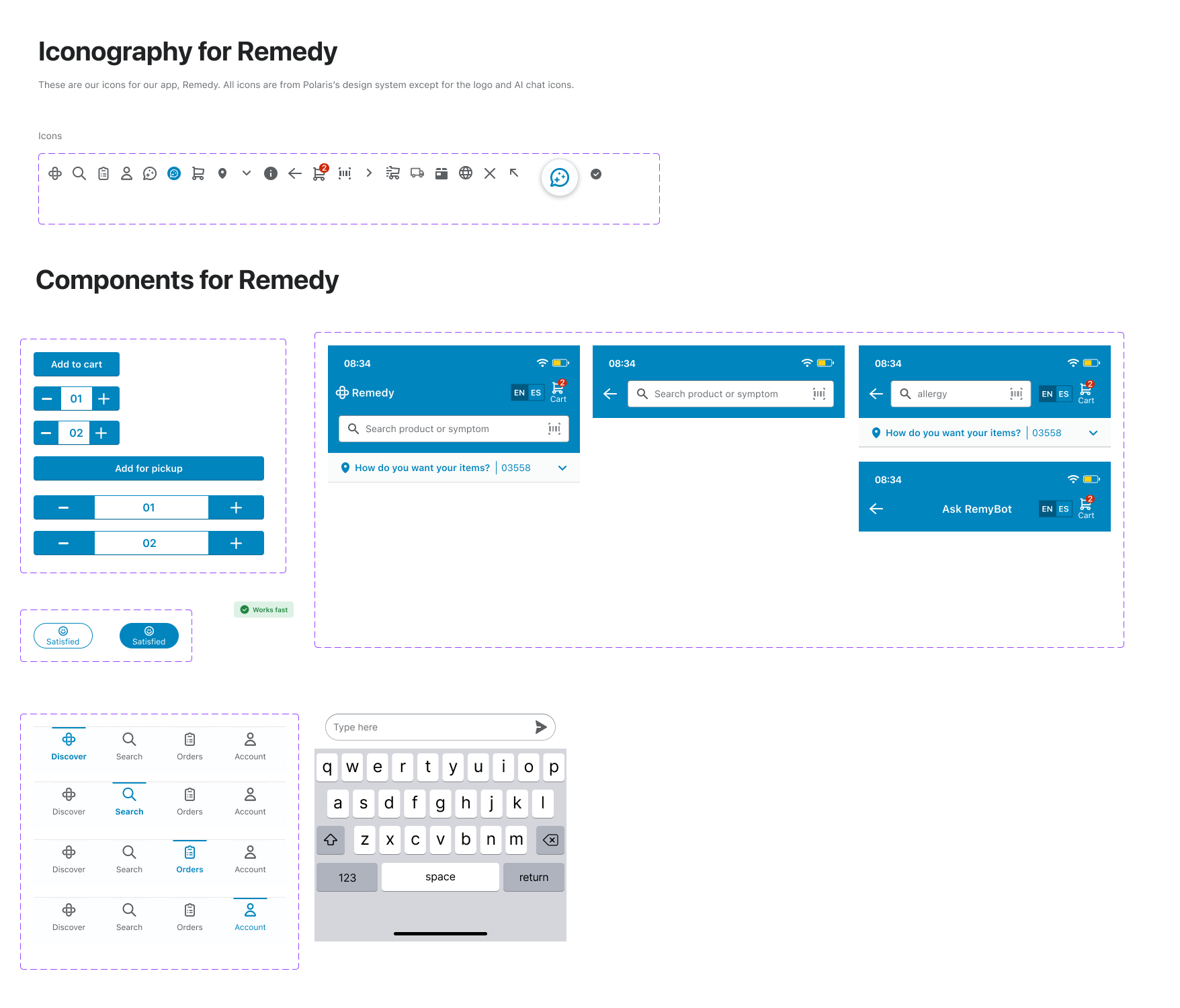
Design System
After viewing several design systems, I recommended to my group, Polaris by Shopify. It is an e-commerce design system built for Shopify admin. I chose this because of its strong focus on accessibility and user-centered design. The team agreed and my teammate, Vaibhavi, had more experience with working with design systems, so she was able to lead us in maintaining consistency and following Polaris’ guidelines. Using a design system ensures that our platform is inclusive, easy to use, and visually consistent. The only thing that differed from Polaris’ system was our main brand color.
**I would also like to note that the logo and title was created by my teammates Vaibhavi & Happy, respectively
UI kit
Final Prototype
We worked together for the discover page and then split the work up because of time constraints. I mainly handled the AI chatbot flow, which you can see on the right.
discover flow
AI chatbot flow
I couldn’t be prouder of my team and I for what we were able to accomplish during this project. It was a valuable learning experience and showed me what great collaboration can lead to.
Importance of teamwork and how it can lead to innovation and success
Effective and open communication achieved through active listening and constructive feedback
Working with a design system and maintaining consistency across the platform
What I learned:
Next Steps
If we had more time..
We would’ve liked to conduct further usability tests on the high-fidelity wireframes to validate our design decisions and show us any potential remaining pain points
Fully design out all pages and features on the app
Incorporate more features that make shopping for your family easier
Include more language options for accessibility


