pho street cafe
website redesign for a restaurant
WEBSITE REDESIGN
Pho Street Cafe is a local Vietnamese restaurant based in Wylie, TX.
OVERVIEW
BRIEF
I was asked to redesign Pho Street Cafe’s website to enhance user experience, accessibility, and drive online orders. Through a user-centered approach, I focused on addressing user needs. The redesign integrates responsive design, accessibility standards, and user-friendly features to create a seamless experience.
ROLE
user research, interaction, visual, prototyping & testing
Sole Product Designer
July - September 2023
DURATION
Problem
Customers are frustrated using Pho Street’s website because of its lack of accessibility and outdated elements.
Solution
A visually appealing and accessible responsive web application that streamlines the online ordering process.
USER GOALS
A streamlined and intuitive online ordering process
Provide easy access to essential information such as menu options, prices, location, contact details, and hours of operation without having to search extensively
Ability to seamlessly order on any device they choose
BUSINESS GOALS
Enhance the website's usability and navigation to lead to increased engagement and promote online ordering
Revamping the website design to reflect the restaurant's current brand identity, values, and unique selling points
Ensuring the site is optimized for mobile to cater to more users utilizing their phones to order online
FROM THIS
TO THIS
Background
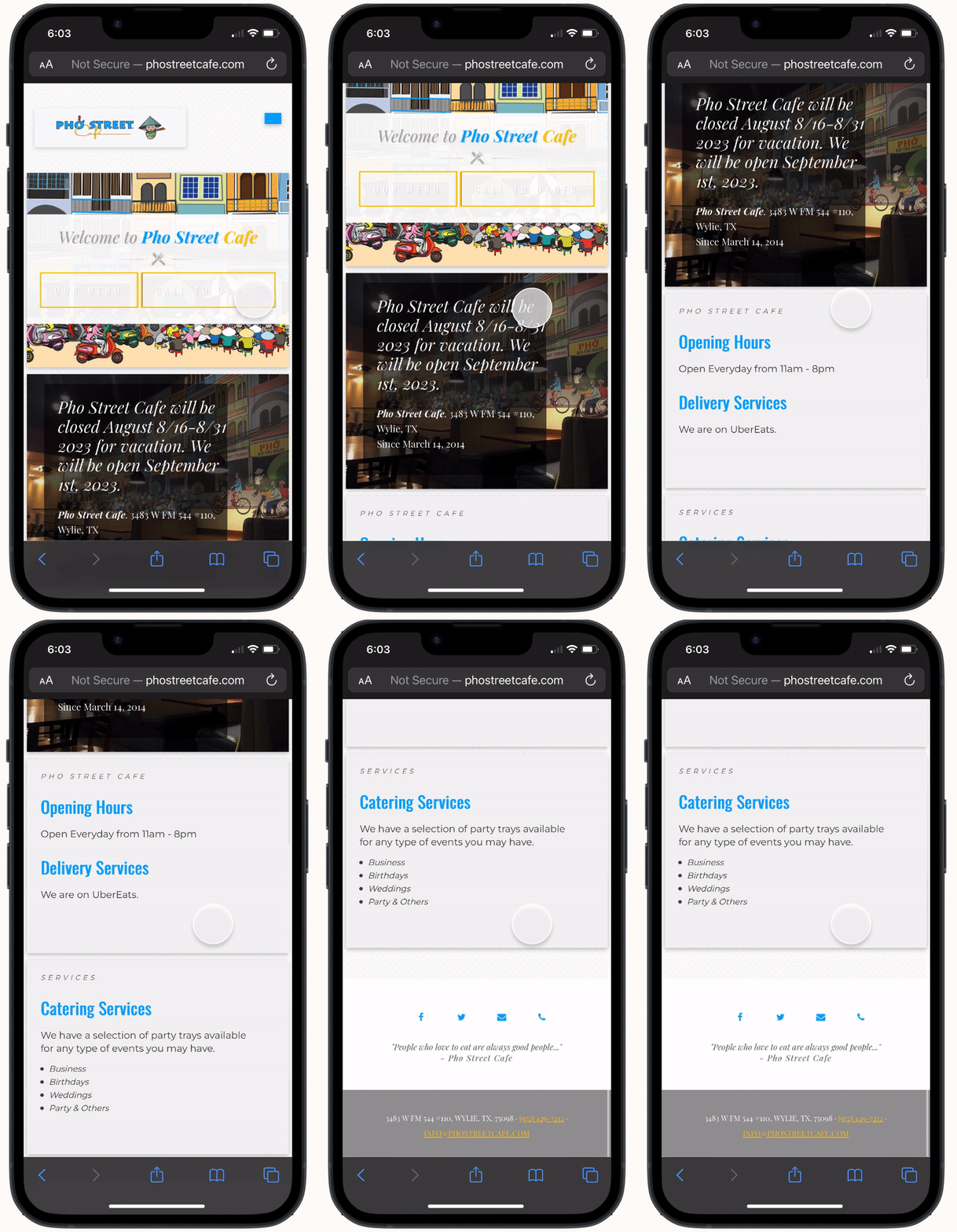
When I initially began the project, Pho Street Cafe’s website lacked CSS, making navigation confusing for most visitors. Upon obtaining access to the original files, I was able to restore the website's former state, complete with its CSS components.
before
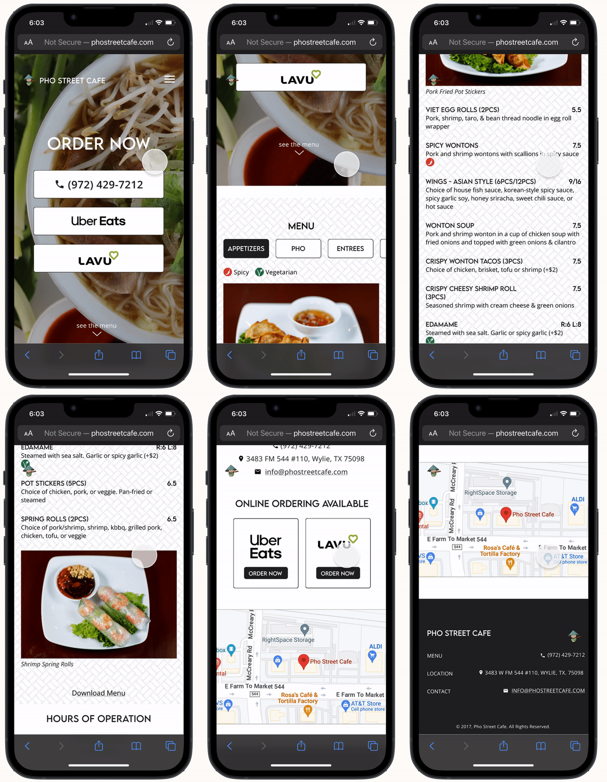
after
The decision to redesign the site was driven by its outdated elements, ranging from pricing to imagery, as well as the presence of features that have become no longer relevant and need to be removed.
The existing website appears cluttered, featuring an array of colors and fonts, this can feel overwhelming when first going on the site. Furthermore, certain buttons and text show insufficient contrast, impeding readability until hovered upon.
close up of buttons
You can see circled in this screenshot of the landing page that it is nearly impossible to read what the buttons say. When the buttons are put through standard accessibility color contrast checks, it fails both WCAG AA & AAA (Web Content Accessibility Guidelines) tests for texts, graphical objects, and UI components. It is not until you hover over the buttons, that a darker background appears making it easier to read.
The reason this needs to be changed is because both default and hover states of buttons should maintain proper color contrasts so that the user can easily see important CTAs at any given time.
Research & Discovery
With the stakeholders seeking a total site makeover, I wanted to validate which features were essential to any restaurant website. I carried out a competitive analysis on four other local restaurants in the area of Wylie.
competitive analysis
Interestingly, the pho restaurants actually lacked an online ordering system and only offered call-in orders for carry out. The main elements that all the restaurants included were: a menu, contact details, & location. Other features like galleries or an about page were only displayed on two sites.
I conducted six user interviews to get a better understanding of what users were struggling with or liked about restaurant websites and online ordering in general. The participants included people aged 17 to 60 who ordered food online with varying frequencies and were recruited through a combination of reaching out to my personal network and communities on Discord. I created an affinity map to develop the key themes and patterns.
affinity mapping
Some insights I gathered were:
Many users prefer to order online over any other method because they value convenience and time
Users prioritize visual assurance when making food choices online, as they seek to experience the dishes before ordering. Including high-quality images of the menu items will likely enhance their confidence, engagement, and likelihood to place orders
Generally, older adults have more of a preference towards call-in orders for simplicity and familiarity
An online ordering system is crucial for restaurants in this day and age, it’s expected
Understanding the Problem
With a clear understanding of the pain points users were facing for online ordering, I was able to create two HMW statements. This helps me narrow my focus and guide me as I brainstorm for potential solutions.
How might we redesign Pho Street’s website to simplify the user journey and increase accessibility?
How might we elevate Pho Street's website to make the user experience more intuitive and save users time?
user personas
From the data of the user interviews, I developed two user personas to further empathize with the users and understand their motivations, pain points, and aspirations. This helps me prioritize solutions that truly resonate with the user. I developed two personas after identifying two primary user groups through my research.
One persona caters to older, more traditional individuals who might face technology challenges, while the other persona addresses the needs of younger, time-conscious users who prioritize convenience.
Ideate & Prototype
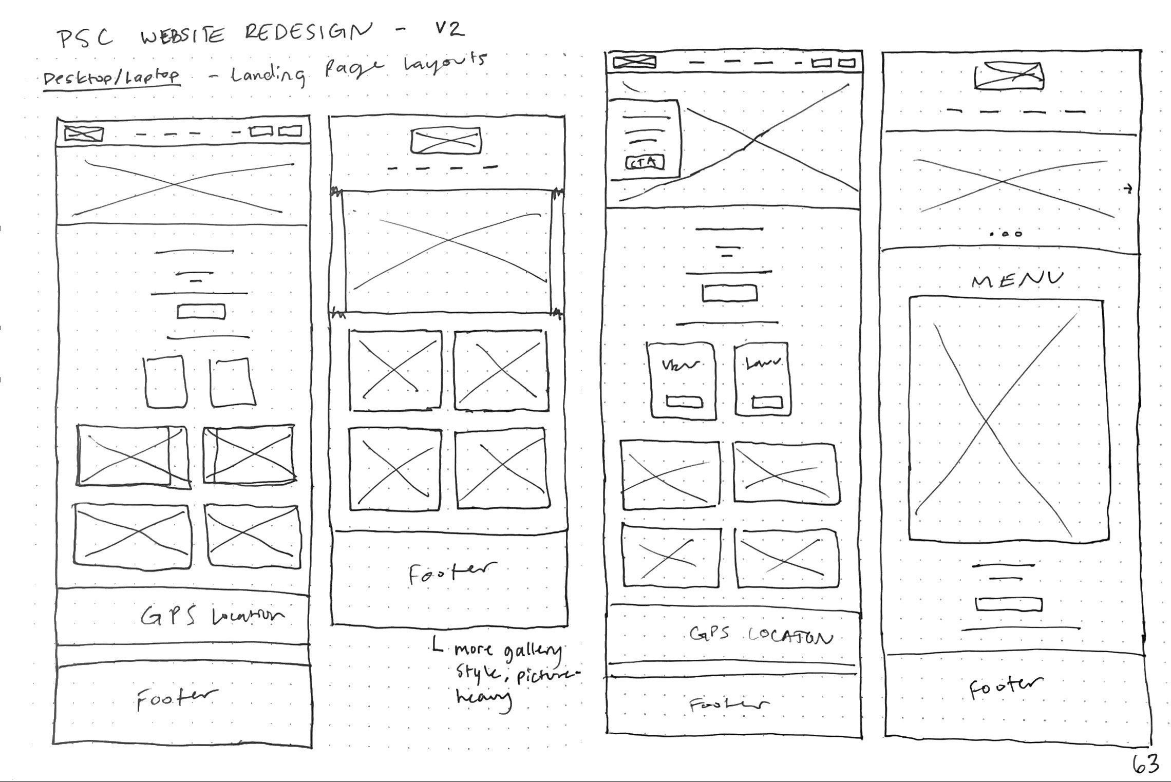
As I began sketching wireframes, the main elements I knew had to be included were: a menu, location, contact, photos of food, & an online ordering system. These were my top priority features as they are essential to any restaurant website and were further validated by the results of the user interviews I conducted.
sketches
Taking the features and elements I felt best would address user needs, I created high-fidelity wireframes to get a better vision of what it would look and feel like.
After drafting this first version, I took it to my peers and mentors in group critiques for initial feedback and iterated on the wireframes to prepare for usability testing.
Version 1
1
1. Doesn’t show phone number immediately, user has to look for it
2
2. Creates an unnecessary step when user can already choose between ordering at top
3
3. Unclear contact information, need to add label
4
4. Potentially confusing (ex. add address icon to clarify it is an address)
These changes addresses potential user pain points and redundant steps that can made even simpler.
Style Guide
I created a style guide to ensure consistency across the entire design, streamline efficiency, and to ease the transition from design to development.
Usability Testing
I conducted a usability test with 5 participants to identify potential issues, gather feedback, and test the overall efficiency of information architecture. The participants were recruited through a combination of connections on Discord and individuals I'm acquainted with, many of whom order food online often. I tested each participant evaluating 4 main topics with various tasks within each: navigation & structure, menu exploration, user feedback & contact forms, visual design & branding.
Recording of participant browsing through prototype during usability test
“... I thought it was really simple and easy to navigate. And it made me feel very, very calm.”
affinity mapping
One of my favorite ways to quickly and easily find patterns from data is by affinity mapping, so I did a second mapping with the notes from the usability testing.
Users found the new design easy to navigate and felt calm while using it
Many users like to see what the dish looks like before deciding to eat there
Users were frustrated that there was no indicator of vegetarian options and you had to scroll to keep looking
Key takeaways from this:
This process validates the integrity of the information architecture, confirming that users can effortlessly navigate the website and locate the desired content quickly. It also highlights a main frustration with users— there being no indicator of vegetarian options.
Final Iterations
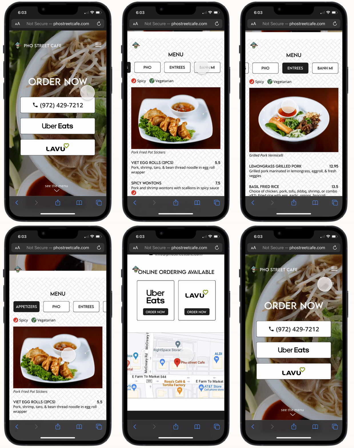
I incorporated indicators for vegetarian and spicy items, accompanied by a corresponding legend. Additionally, I enhanced font and button sizes for mobile to adhere to accessibility standards and meticulously refined the design in preparation for a smooth handoff to the developer.
After fixing the problems found through the usability testing, I discussed the latest version of the site with the stakeholder and they were very pleased with the results. I then prepared the designs for hand off and sent them to the developer, James. I would also like to note that throughout this process, I consistently discussed with the developer any new ideas I had to ensure that it was feasible.
browsing through the site in mobile and laptop
This redesign has the potential to impact the frequency of online orders, user engagement on the website, and enhance customer satisfaction. To gauge the effectiveness of these changes, I will monitor and track these success metrics over time to assess the tangible outcomes of the redesign effort.
With the design now fully developed and refined, the project has been successfully shipped. After a three-month period, I followed up with the stakeholder to assess the site's performance. I'm delighted to report that it has been thriving. Below, you'll find key statistics and excerpts from customer feedback provided by the stakeholder.
Online ordering sales have since increased by 15% and overall customer satisfaction has improved
“I really like the new site, it’s so much easier to use.” -Lourdes
“Loving the new update! So easy for me to order online now.” -Daniel
Through this redesign process, I gained valuable insights into the intricate relationship between user needs and design decisions.
I learned how aligning design choices with user preferences and pain points can lead to a more intuitive and satisfying user experience
I realized the importance of user testing to validate potential solutions
I discovered the importance of a user-centered approach in not only enhancing usability but also in achieving broader business goals such as increased online orders and improved customer satisfaction
I learned the importance of involving the developer early on to understand the feasibility of certain features
Key Insights
This experience showed me the significance of continuous adaptation and refinement based on user feedback and data analysis, reinforcing the iterative nature of effective design.


